So i’ve had the thought floating in the back of my head for a few days but, the new handmaiden skin is much too similar to the base one for a premium cosmetic.
Just compare the differences between these two to the likes of what shade got and its really way too little, and the dang hat is horrible. I highly recommend either setting a very low price for it, or even making it available with shillings, or withdrawing and redoing it.
Because this isnt something fit the title of “premium” : (
Well, we’ve already had the same situation with pyro, so it’s hard to imagine anything changing. Also, it’s kinda sad that the base “hat” is leagues beyond everything else on offer, be it free, priced in shillings or real world currency.
Eh, i still think it should be said, or written rather.
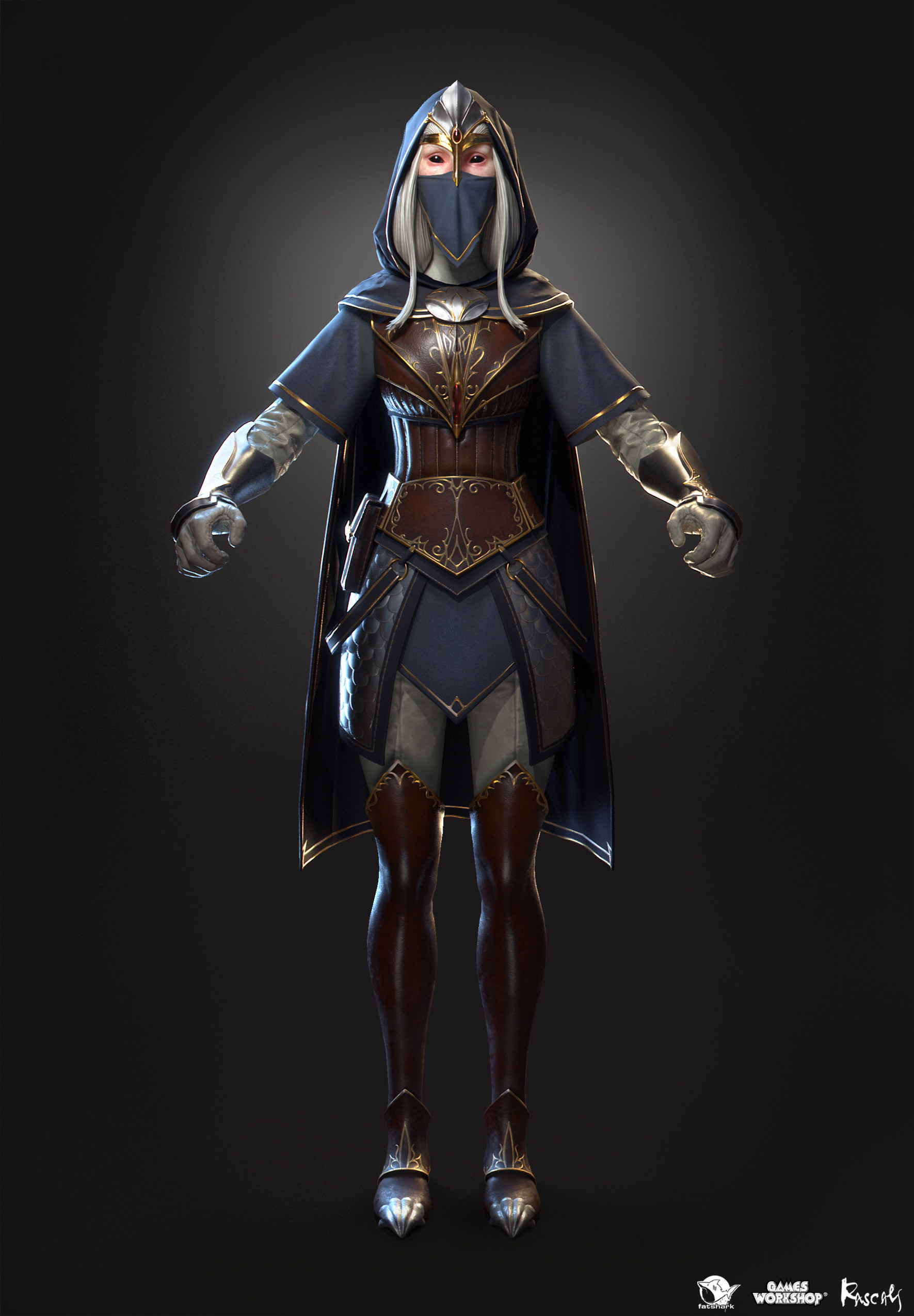
As for the base hat quality…well to me it just that the others are too big of an image change, goes from a hood to a skintight …headcover? with a bit of metal on it, several editions of that really.
And i do not really like any of em.
The one piece aside from base hood i do not think looks bad though is the actual cash helmet that exists, it looks rather good even, but not so amazing that i´ve felt the need to buy it. And now that we finally get a premium cosmetic for handmaiden its…once again something really subpar T_T
Best addition so far was the white recolor, a dang recolor.
i agree. that “premium” cosmetic looks like something anyone could buy for very little ingame currency. come on fatshark! you can do better. that shade, bounty hunter and mercenary skin looks dope af. regarding the fact that handmaiden is one of the best careers in the game you could have gave us something a little more high quality
I mean, it’s the same outfit in OP’s post as that picture either way? I’ve already seen that picture in the original announcement post.
Does it look identical? No. Does it look different enough to be a premium cosmetic? Not really IMO, unless we’re talking about the hat, which is just plain ugly.
It’d be a nice enough shilling cosmetic… if we were to ever get more of those.
Except it is, it is literally the same base model but with a handful of minor differences.
Scalemail corset ontop the base one.
Waistcloth instead of scalemail plates
Slightly more armor and a gem on each boot.
A gem on each arm guard.
More detailed button for the cloak.
Possibly some more color saturation.
Everything else if just talking the skin? Exactly the same, same base armor,same arm guards that the new skin puts gems on, same clothing and style, a real far cry from what Shade or saltz got. The only real different thing is the hat…which is horrible.
reminds me of the times that people were once again complaining about how bad the available upgrades to all skins feel be it weapon or character skin accessible via challenge or shilling and their response was that they are limited by what Games Workshop allow them to publish. Yet somehow slayer with flintlocks on his sash seem lore friendly …
Maybe I need to dive a tad deeper in the lore then ! But still I do not think that my luck of lore knowledge justifies their lack of other lore friendly awesome skins / weapons.
Its actually easier to find similarities than differences with these 2 skins. I really think that should say enough about how bad it is. At the very least I would not buy it when there are so many more superior prem cosmetic skins.
Yeah, that seems like a very poor excuse for Fatshark’s lack of talent or effort. Games like Total War Warhammer or even something like Warhammer Chaosbane don’t seem to suffer such artistic limitations. Not to metion that this is not something Fatshark would have to create on their own. As I said, there are tons of materials published by GW.
For example take a look how Handmaiden hero looks in TWW2.
They could totaly follow up on this style (thought not entirely copy it ofc), creating a more unified look throughout these games of the same franchise.
Or as I posted in one previous post months back, open the fricking Uniforms & Heraldry book for each race and at least create some new shillings shield skins:
I guess if I want to look hard enough I could say that the only good thing about this “premium” skin is that it is an upgrade to the original crappy larp costume Handmaiden wears by default.
I wonder if it qualifies as an upgrade really…if i saw someone using the skin at a glance during a game i do not think i´d be able to tell at all. Not without the outrageous hat. If they were using the hood? No way i´d really notice if they got the extra corset or not.
I wonder why, out of all Asur cone helmets, they decided to go with the Reaver one, which I always found to be a bit odd. Though I am still curious how it will look in-game. So far the colour scheme and materials look a bit… cartoony in comparison to everythin else.
If i had two paintings of an apple, one in which the apple is red and one where it is green then you´d tell me the two paintings are completely different.
As if i wasnt looking at an apple in two different colors at all but a pear and an orange instead.
…
In the same vein here, base skin with a couple of gems and an armored corset ontop of the existing one is not a proper new skin. The differences are extremely minor. The only major difference is the hat but that´s a separate piece.
A new&different hat does not mean the skin is new and different too.