May be not a big issue, but one of those tiny ones that cause death by thousands cuts to this game.

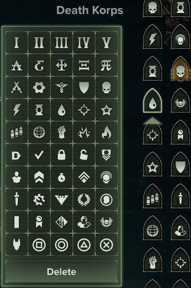
What those are even supposed to mean? Looks like something they found in pharaoh’s tomb and still struggle to decipher ![]()
One would think the most logical choice for icons would be the class’s weapon’s icons may be? With a couple extra layers so you could easier distinguish between several builds with same weapons. Something like this:
- That builds pane in the upper right is turn into much bigger, multi-component icon, which only show you the icon of your current build. The other builds’ icons are accessible in a dropdown list after you click it (so they won’t obstruct your view on character’s model)
- The build icon itself is split diagonally in two fields, each of which can be assigned an icon of weapon that builds use (so you see immediately what is it about) - this actually should be done automatically by the client
- There is one more background field you can assign some more abstract character to - may be even those very characters we see on the picture above. It’s just to give some context
- Color coding is introduced, which adds a tint of selected color to the whole thing. So you can have two builds with same weapons and “Explosion” background for your ogryn - but still figure out which one is more “speedy” one because it has a yellow tint to it.