Sorry, but how on earth did it end up like this? Maybe you wanted to make it look new to go along with the difficulty overhaul, but it honestly just looks like a beta version…
Could you either revert it or replace it with something a bit more decent? please…
30 Likes
I agree. If you told me the new mission terminal was a placeholder, I’d believe you.
4 Likes
Terrible. No real advantage in terms of player agency / mission selection.
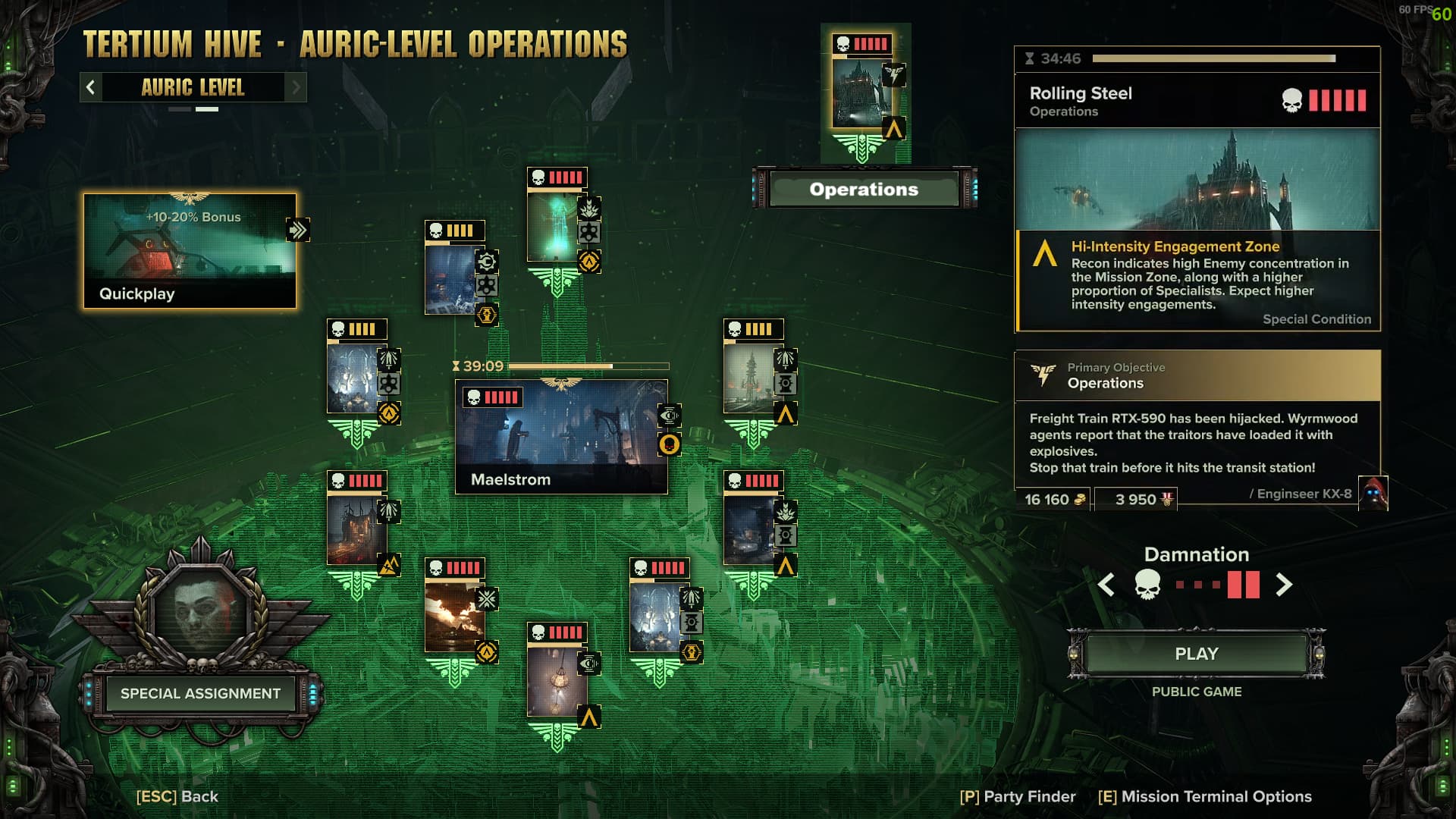
Some modifiers like HISTG are flat out gone and we effectively only got one more mission.
Talk about wasted dev time. Just give us mission and modifier selection.
7 Likes
You might think I am over-reacting, but I am really annoyed about this change; in fact I am downright angry. Which moronic fool decided on this change? Why would you take an awful design and make it worse?! Do those responsible for signing this off not even have a basic understanding of UX design?
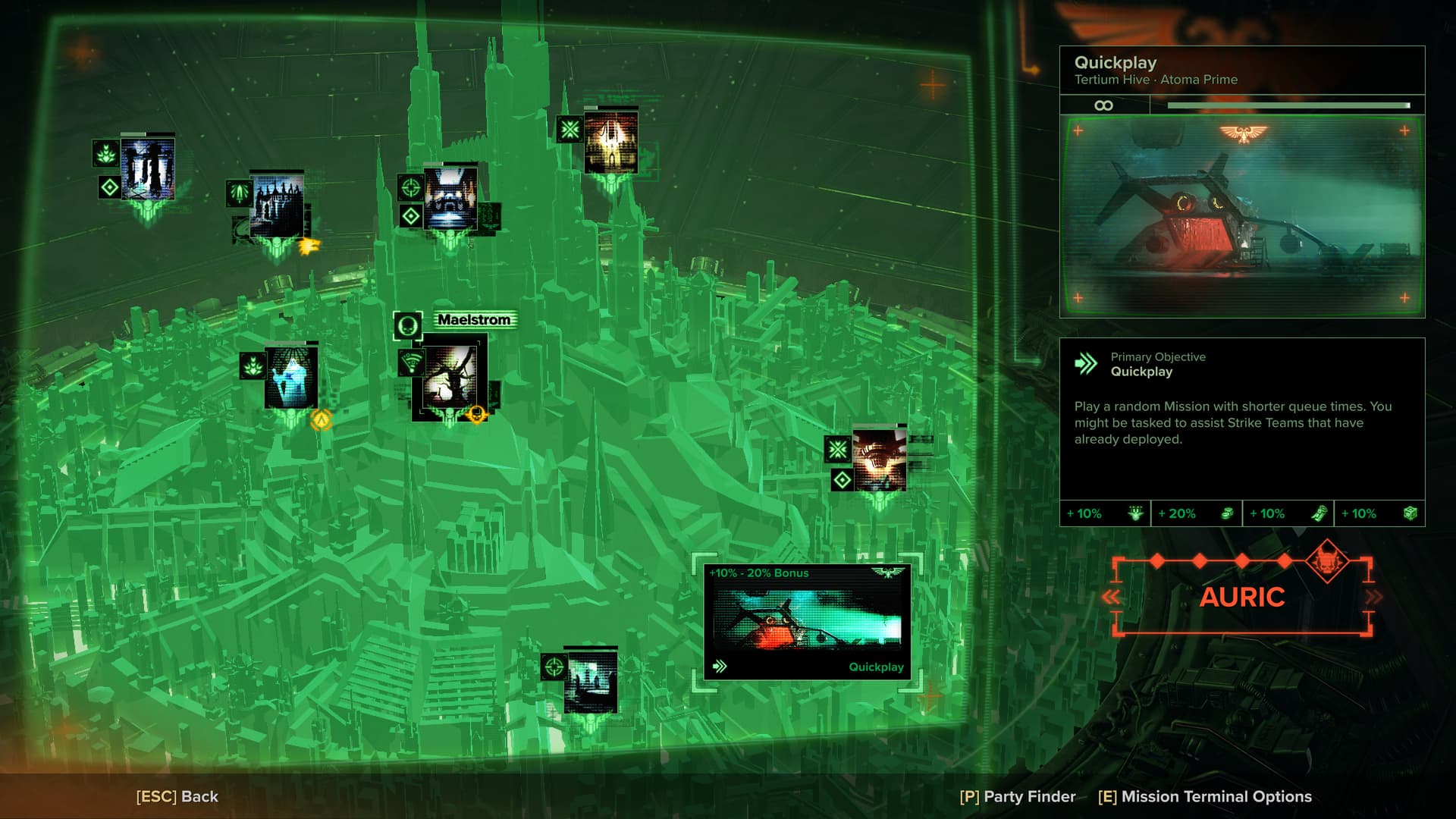
I’m red-green colourblind and the vanilla mission selection screen was annoying enough to deal with but manageable, as my brain has to work overtime in the comprehension department to differentiate between the green and the icons. However, the new one is just egregious. Scattered icons but now on a bright and bold green background? Thanks Fatshark!
It stuns my mind that FS has doubled down on its inability to provide even the most basic and sensible design for the single screen we interface with the most. Now that Sorted Mission Grid no longer works, I cannot use that mod, but look at the screencap of it below. The missions are laid out in a neat and easy to read format in difficulty order, everything you need to interact with is there as clear as sunshine breaking through clouds. Why would this not even be the basic layout?

15 Likes
Giggles aside. I get they are trying to emulate imperium technologies with tube monitors quality.
But UI should be readable, not like those map icons. Also i have a feeling that people with eyesight/headache problems can struggle cause of high saturation and contrast.
7 Likes
Now let’s imagine how much time the developers will need to “fix” it. Do you know what the main problem is? In the absence of a publicly accessible test server where everyone can test it in advance, give feedback in the appropriate topic, and the Sharks can quickly fix something. These are forgotten secrets and technologies of the ancients.
3 Likes
I like it way better than to older version, it is clearer and neater.
The style is appropriate, but the number of missions has become smaller, and the colors are inadequately irritating, which burn my eyes
3 Likes
I’m pretty sure testers gave them feedback about new ui and FS just ignored it.
And even when they test something in beta it’s always too close to release.
FS just need to change their attitude and development process first of all.
Also no way noone in the office said it’s just bad.
6 Likes
Fatshark and ignoring all feedback while trying to reinvent the wheel on something they’ve made before, name a more iconic duo.
7 Likes
This part at least I can say is misleading. As far as I know they just bundled the high-intensity modifier into the new hardest “Auric” difficulty which is just damnation but high-int. So play an Auric STG and you’ll get the same experience.
Everything else is right, though, this interface is just ugly and looks like crap. You already had a perfectly fine brutalist technology aesthetic that was useable, now you have… this, and a cutscene after the first campaign mission where I couldn’t understand a single word being said because it was put through a million filters.
1 Like
i suppose we’ll just wait for some modders to fix it for us
3 Likes
if it’s not broke, don’t fix it
I really don’t like mission pictures.
1 Like
if anything they incorporated prefer auric mod
They did. Still looks like ass though.
1 Like
I remember they overtuned psyker surge stuff vfx wich caused headache and nausea for some people. @FatsharkKitefin guys have a concern about that.
2 Likes
Again, just like those surge staff changes, changes like this go from designer to their manager, to the game director, to the programmers and testers, and no one there brought up anything?
2 Likes
I’ve played 3 auric missions now, and this does not seem correct.
Every mission is completed in 19 minutes or less. Auric is NOT high intensity at all. It feels like regular damnation.
The new mission board is terrible. Both visually and practically it’s a total downgrade. I had no idea the board could get any worse but Fatshark sure found a way.
1 Like
It’s like there is no internal check. They just give a task to some intern and add it right to the live build. Or even if there was some tests then “it’s too late to change”.
Like i realy can’t imagine devs just do some test runs in the office and see nothing wrong.